Activating Martian software
on Earth
PIXLISE is a science analysis tool used by NASA scientists to identify potential signs of life on Mars. Partnering with science and product teams, I designed PIXLISE’s public debut. I generated all technical content and crafted the product’s initial deployment and messaging strategy for launch. 🚀
Design fully implemented in Spring 2023.
Design fully implemented in Spring 2023.
Role
Design Lead
Design Lead
Skills
UX/UI Design
Info Architecture
Product Strategy
UX Research
Copywriting
Visual Design
Design Systems
UX/UI Design
Info Architecture
Product Strategy
UX Research
Copywriting
Visual Design
Design Systems
Client
NASA Jet Propulsion Laboratory
(PIXL Science Team)
NASA Jet Propulsion Laboratory
(PIXL Science Team)
Duration
10 weeks
10 weeks
SOLUTION OVERVIEW
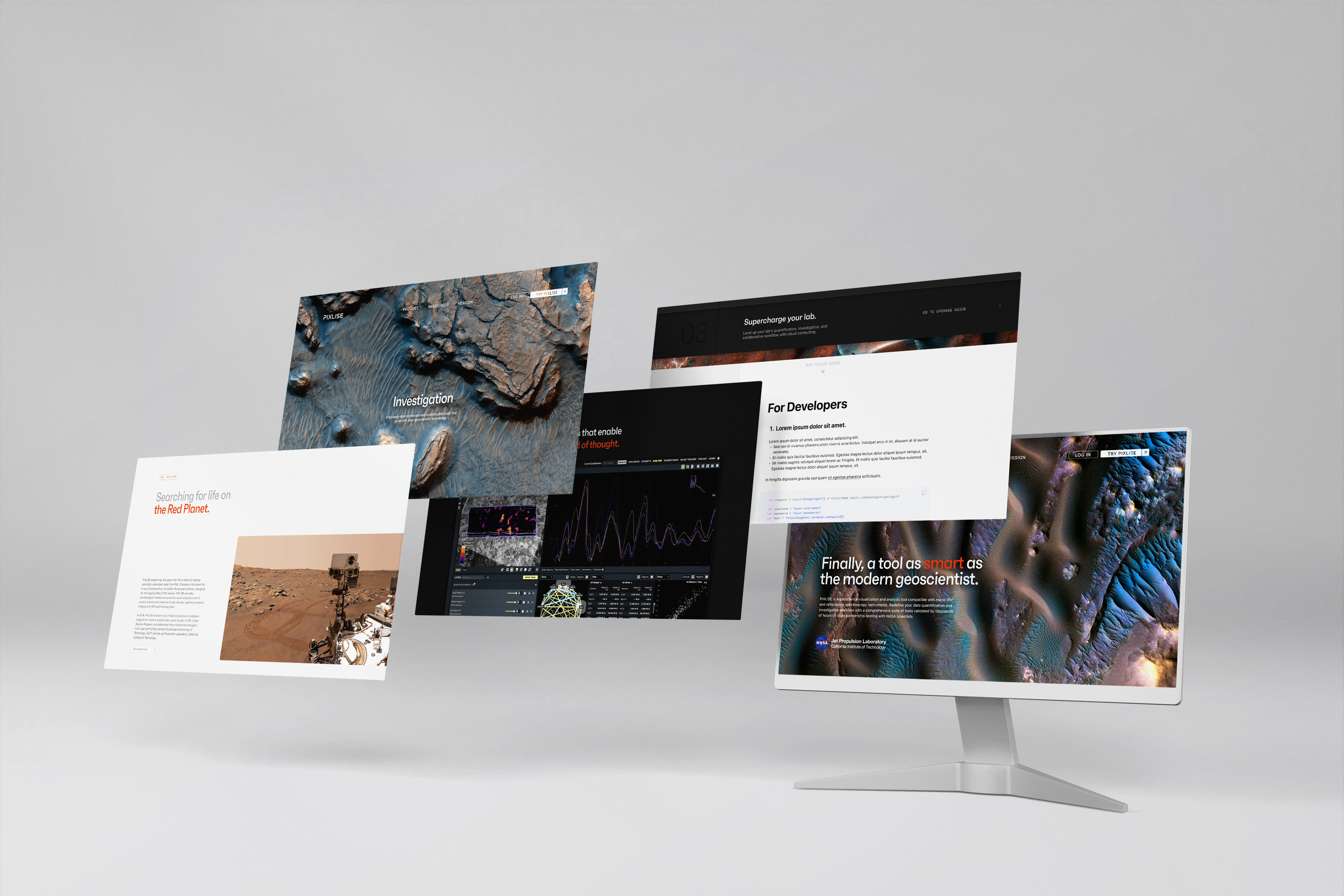
Previously limited to a small science team at NASA, PIXLISE is now accessible to all geoscientists. Quickly survey complex features and potential use cases, understand PIXLISE’s value to your lab, and take steps to deploy powerful software the very same day.
Enabling Earth labs to make groundbreaking discoveries with PIXLISE
Previously limited to a small science team at NASA, PIXLISE is now accessible to all geoscientists. Quickly survey complex features and potential use cases, understand PIXLISE’s value to your lab, and take steps to deploy powerful software the very same day.
1. Grasp complex features in seconds
PIXLISE’s flexibility supports several subtypes of science users, and every scientist’s workflow is different. The new site highlights PIXLISE’s ability to handle it all by breaking down all product functions into the following:
Workflow: how users cross-reference and collaborate
Quantification: how users validate data
Investigation: how users explore and analyze
2. Reimagine science collaboration
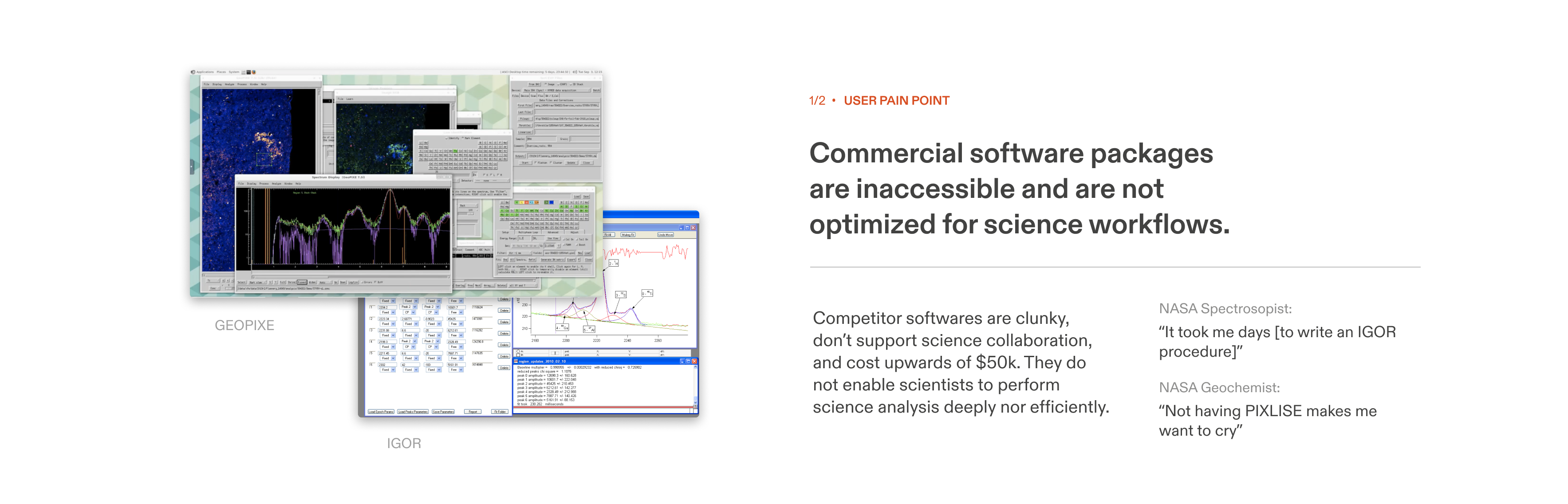
Scientific inquiry is incredibly interconnected, but existing software don’t enable collaborative workflows.
In addition to highlighting novel collaboration features, PIXLISE community forums, developer guides are just a click away.
3. Evaluate for fit and adopt
Replacing 1:1 product demos with a layered adoption flow enables potential users to try features autonomously. This cut onboarding from weeks to minutes, allowing the product team to focus on shipping awesome features.
Explore the final prototype here.
Peek into the process:
OPPORTUNITY
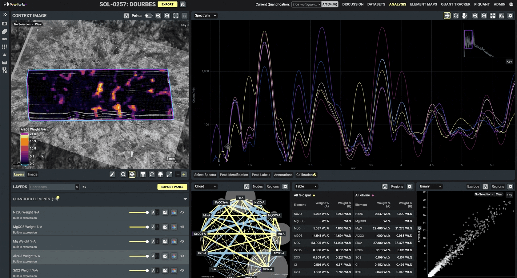
PIXLISE helps scientists analyze XRF spectroscopy data from the Mars rover’s PIXL instrument, enabling NASA scientists to piece together the geologic history of Mars and identify potential signs of life. Despite this incredibly specific use case, PIXLISE’s functions are applicable (and revolutionary) to all geoscience workflows.
The PIXLISE product team at NASA JPL approached me to distill its capabilities into a compelling story to engage a new world of users.
Mars science tools are useful for Earth scientists too
PIXLISE helps scientists analyze XRF spectroscopy data from the Mars rover’s PIXL instrument, enabling NASA scientists to piece together the geologic history of Mars and identify potential signs of life. Despite this incredibly specific use case, PIXLISE’s functions are applicable (and revolutionary) to all geoscience workflows.
The PIXLISE product team at NASA JPL approached me to distill its capabilities into a compelling story to engage a new world of users.

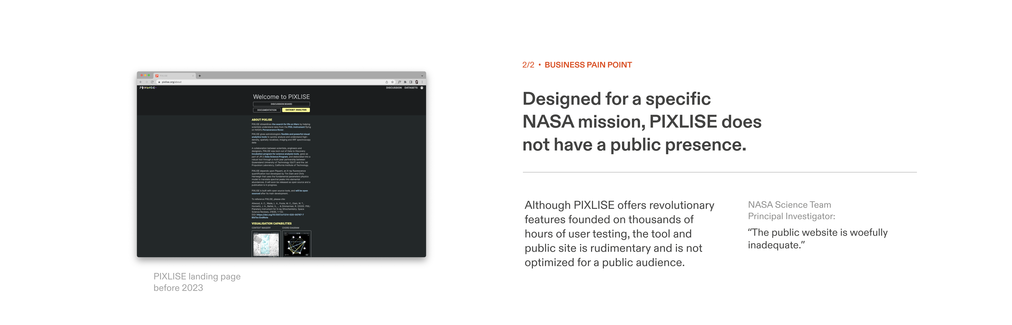
PROBLEM
Previously, PIXLISE’s front page contained only the most basic information about the tool. The team lacked perspective to communicate product value to external users. (Scientists are also too busy doing science to leave reviews...)
Without intentional restructuring, the tool would never grow beyond its initial user base.
PIXLISE doesn’t know what makes PIXLISE beautiful
Previously, PIXLISE’s front page contained only the most basic information about the tool. The team lacked perspective to communicate product value to external users. (Scientists are also too busy doing science to leave reviews...)
Without intentional restructuring, the tool would never grow beyond its initial user base.
Challenge


RESEARCH OVERVIEW
I had no prior experience working in the technical subject area of planetary geoscience. With research I hoped to understand why PIXLISE works so well for Mars.
Crash course in the product, existing users, business, and competition
I had no prior experience working in the technical subject area of planetary geoscience. With research I hoped to understand why PIXLISE works so well for Mars.
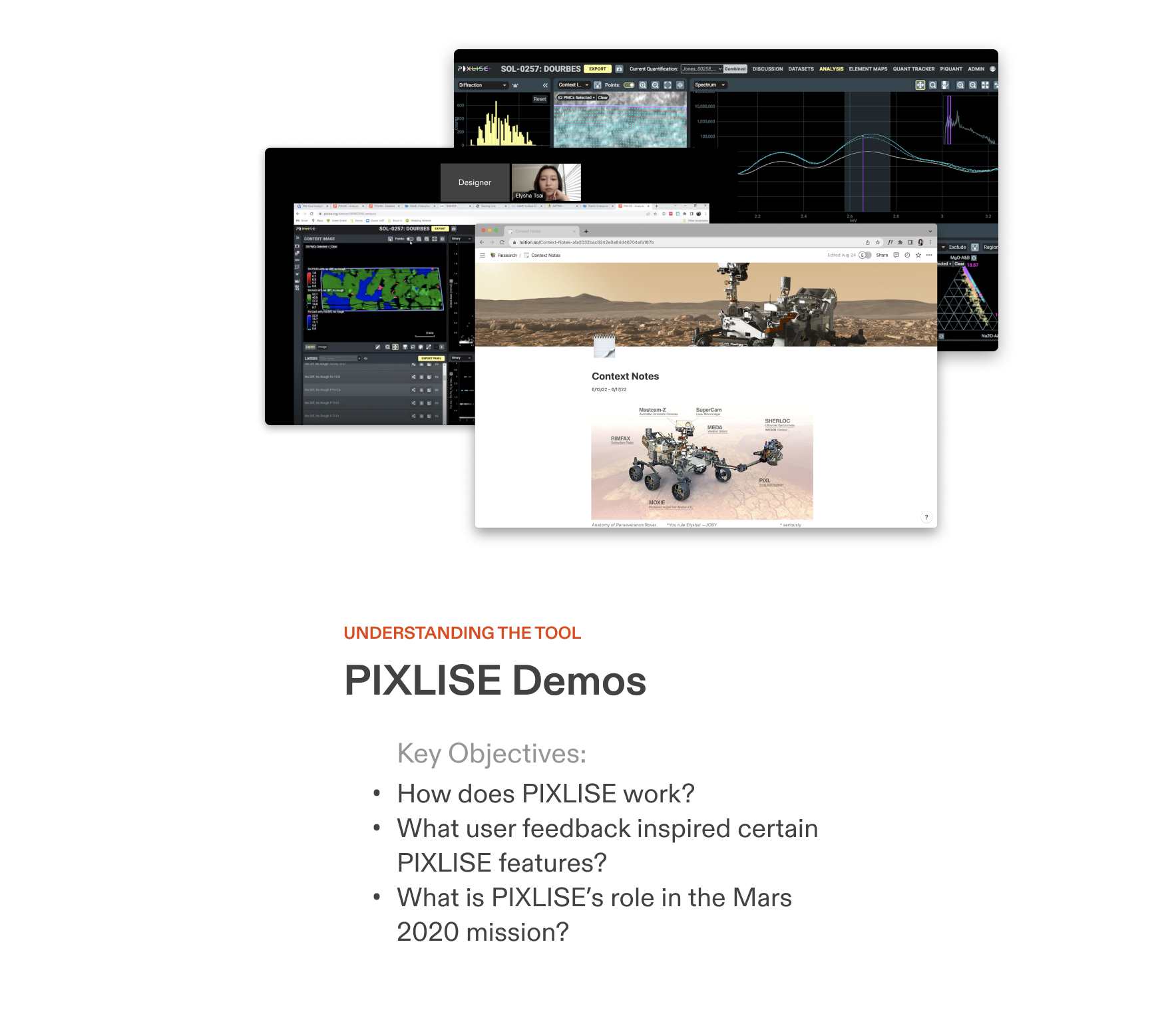
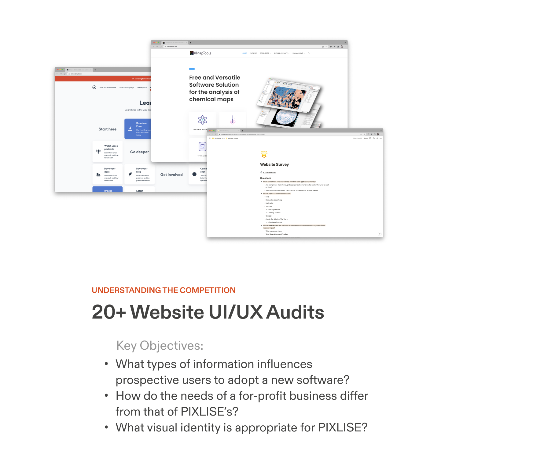
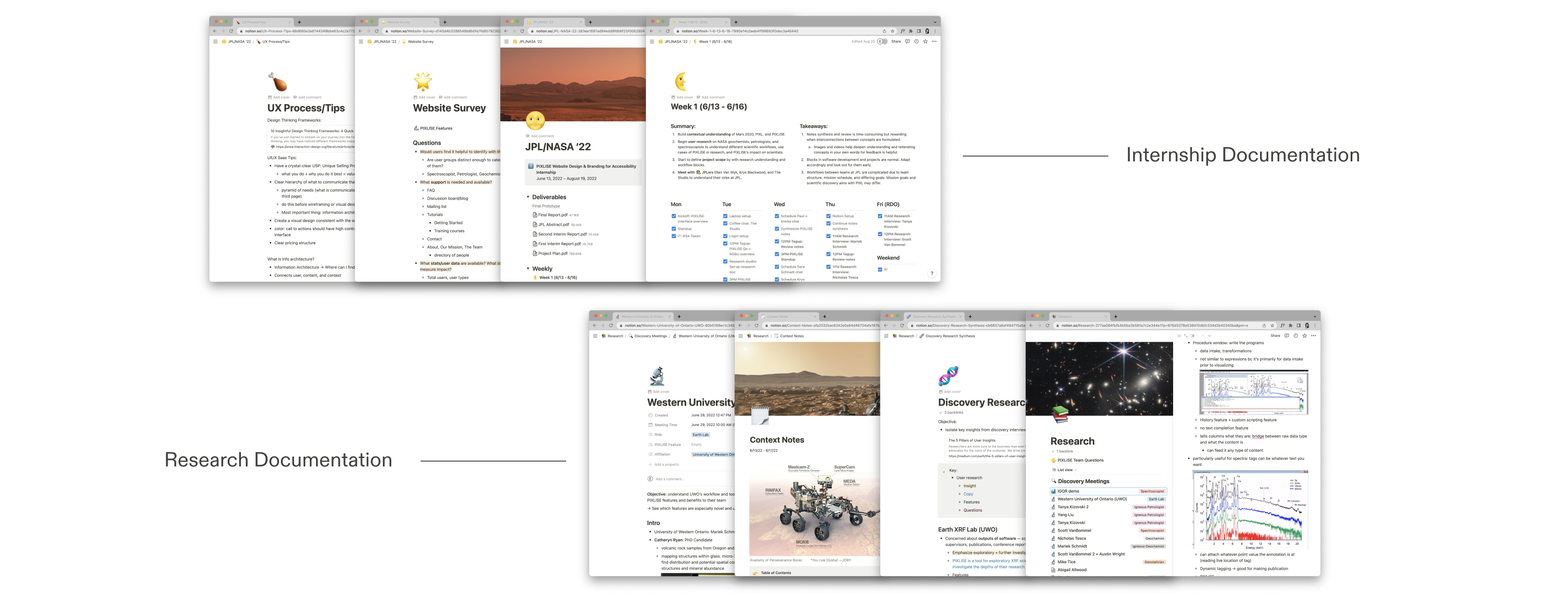
Custom Notion setup to stay organized!
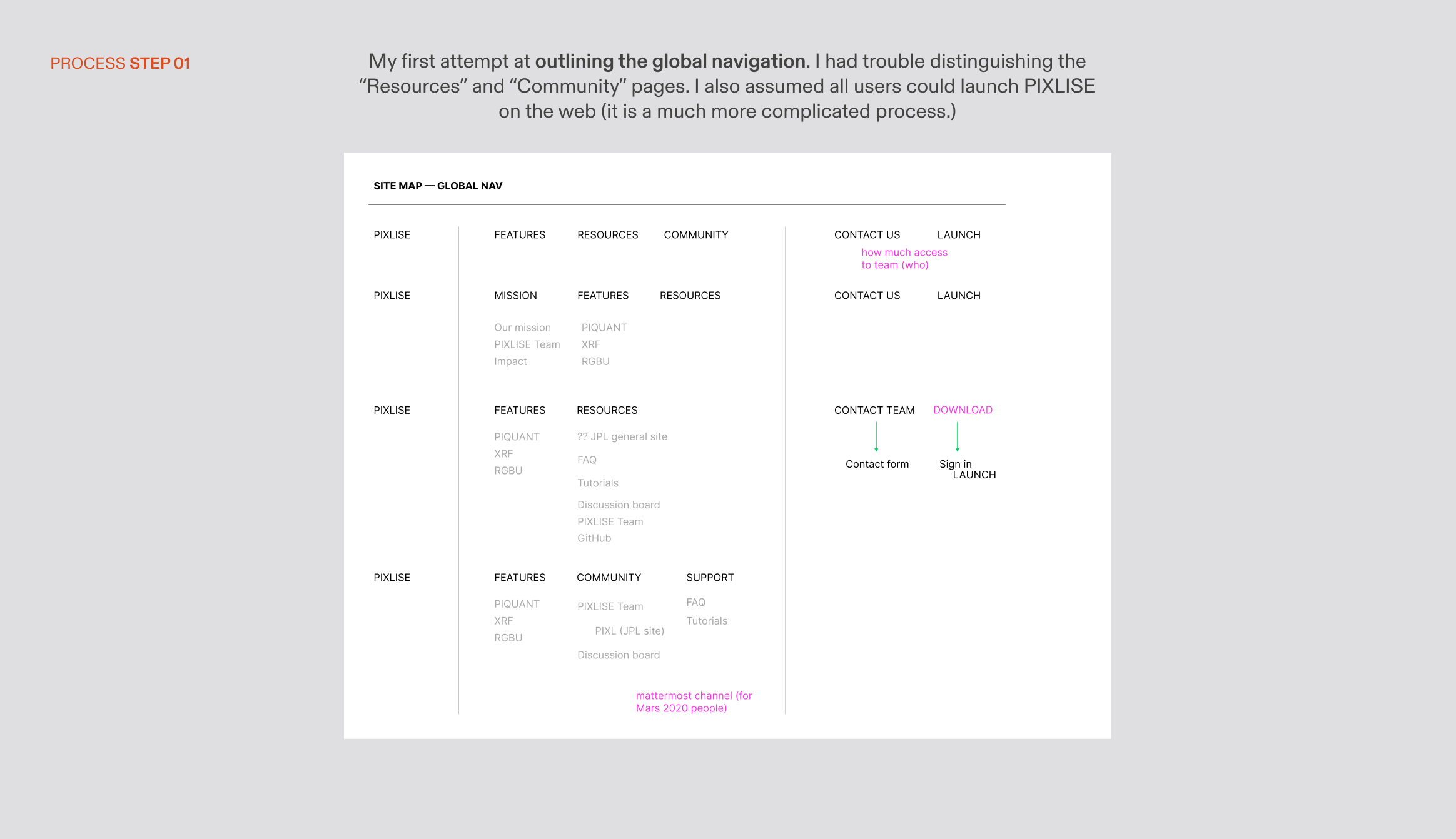
INFORMATION HIERARCHY
After some trial and error, we discovered that it was most helpful to guide scientists to talk through their workflow. It was my job to weed through the complexity and specificity of each use case, not theirs.
I devised an expert-reviewed organization of product feature information with six levels of information granularity. At the highest level, PIXLISE is characterized by flexibility (in workflow), speed (in quantification), and innovation (in investigation features).
User workflows reveal what makes PIXLISE special
After some trial and error, we discovered that it was most helpful to guide scientists to talk through their workflow. It was my job to weed through the complexity and specificity of each use case, not theirs.
I devised an expert-reviewed organization of product feature information with six levels of information granularity. At the highest level, PIXLISE is characterized by flexibility (in workflow), speed (in quantification), and innovation (in investigation features).
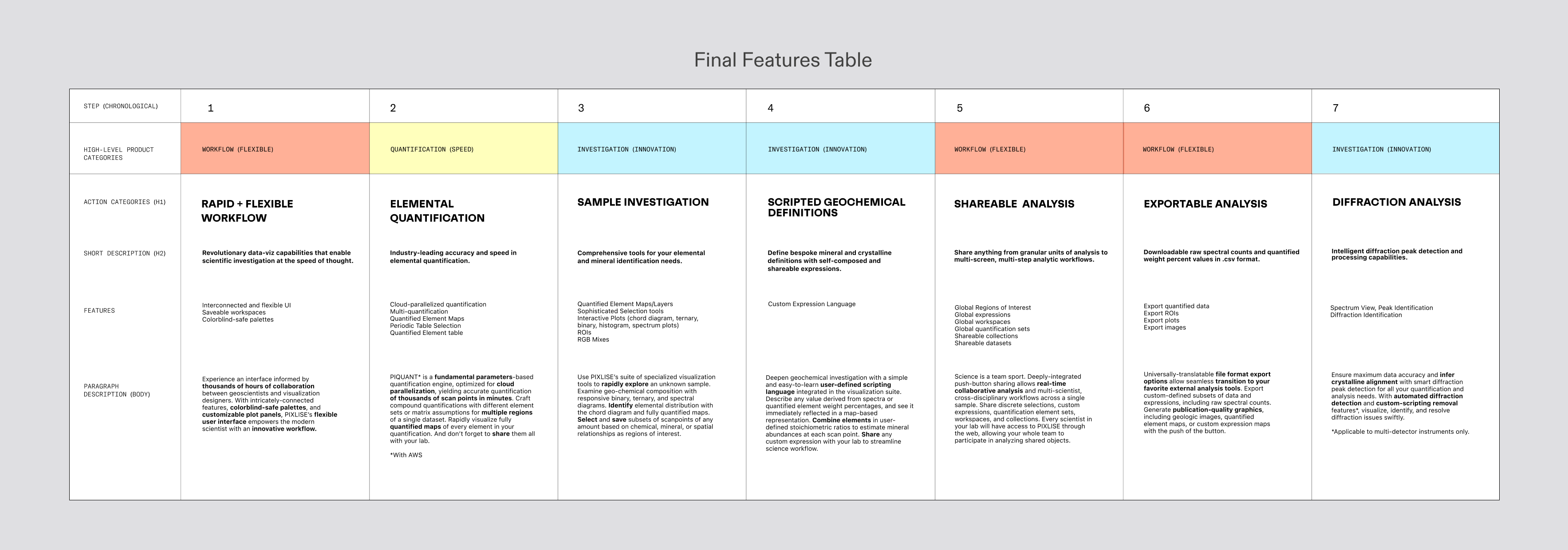
It translated gracefully into my first iteration of wireframes for the Landing and Product pages, and is a huge improvement to the 4 cards on the site previously.

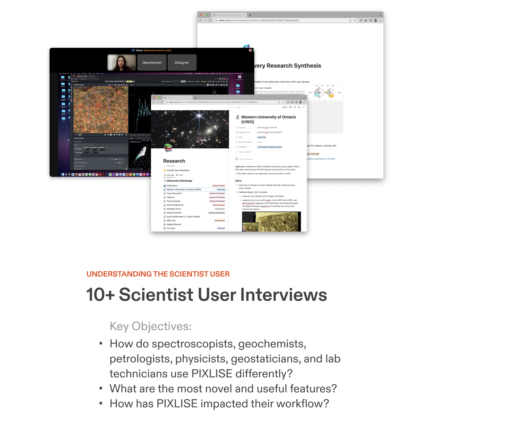
SYNTHESIS
One of the biggest challenges in this process was only having access to 1 target user for research (thank you, UWO Lab!). Our limited access to target user was incredibly useful: speaking to a real lab helped us understand the technical constraints that would increase friction between PIXLISE and a new user.
Limitations in Earth science workflows illuminate call to action for PIXLISE
One of the biggest challenges in this process was only having access to 1 target user for research (thank you, UWO Lab!). Our limited access to target user was incredibly useful: speaking to a real lab helped us understand the technical constraints that would increase friction between PIXLISE and a new user.
Personas
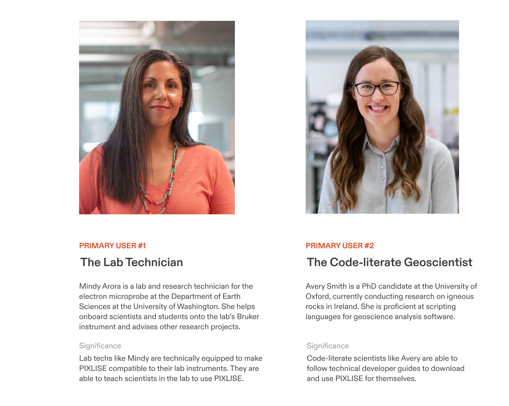
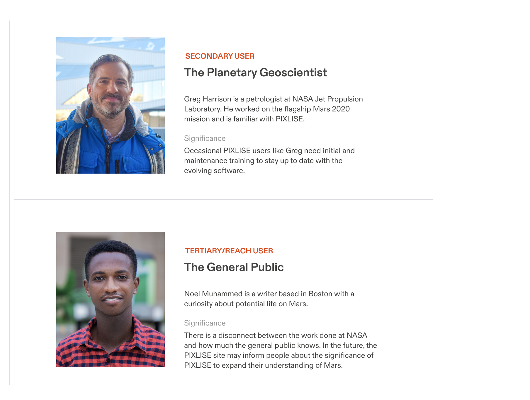
Getting specific about personas and journeys helped determine the call to action (CTA) of the site: direct users to explore PIXLISE’s features in the trial version.
The call to action is now at the bottom of every page and the main navigation.
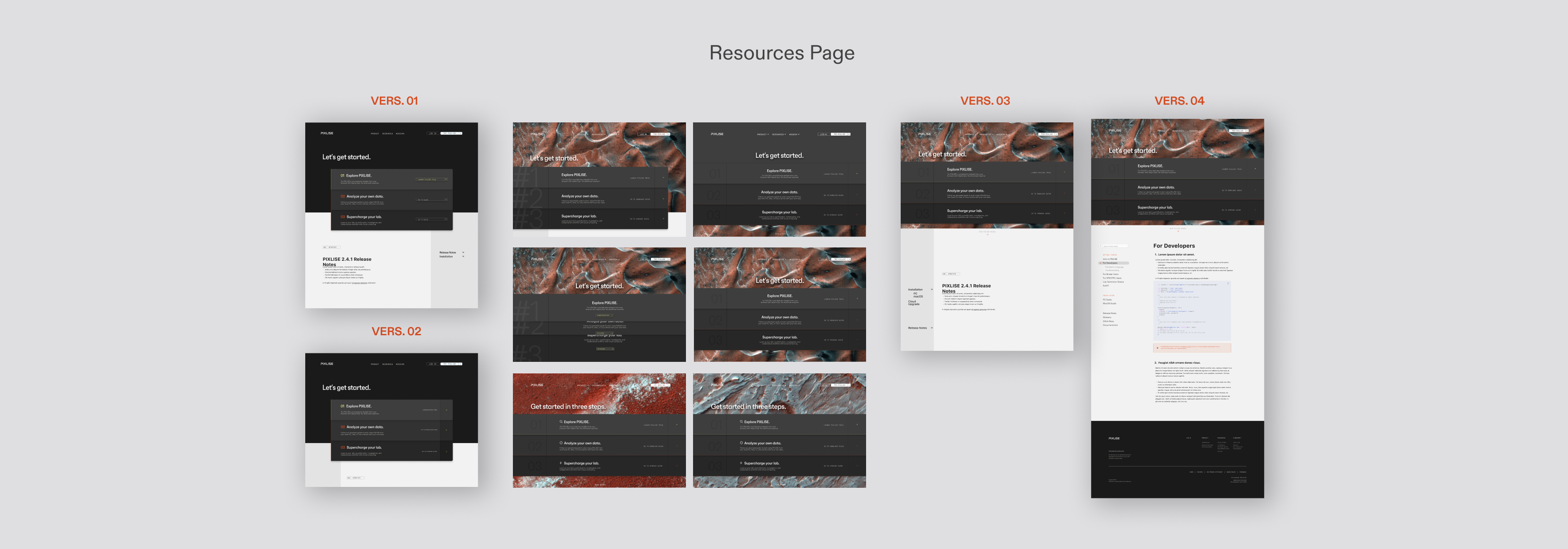
The deployment plan also translated into the content above-the-fold of the Resources page.
USER EXPERIENCE
The variety of science users we gathered research from helped me devise a strategic flow: leading with 3 digestible product values, highlighting workflow user paint points, and using imagery to articulate use cases in presenting a solution to these challenges.
Lead with values and pain points, let use cases follow
The variety of science users we gathered research from helped me devise a strategic flow: leading with 3 digestible product values, highlighting workflow user paint points, and using imagery to articulate use cases in presenting a solution to these challenges.
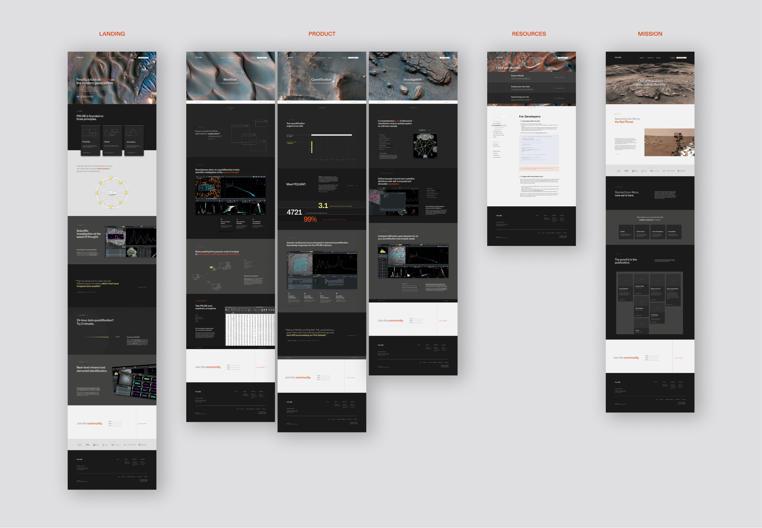
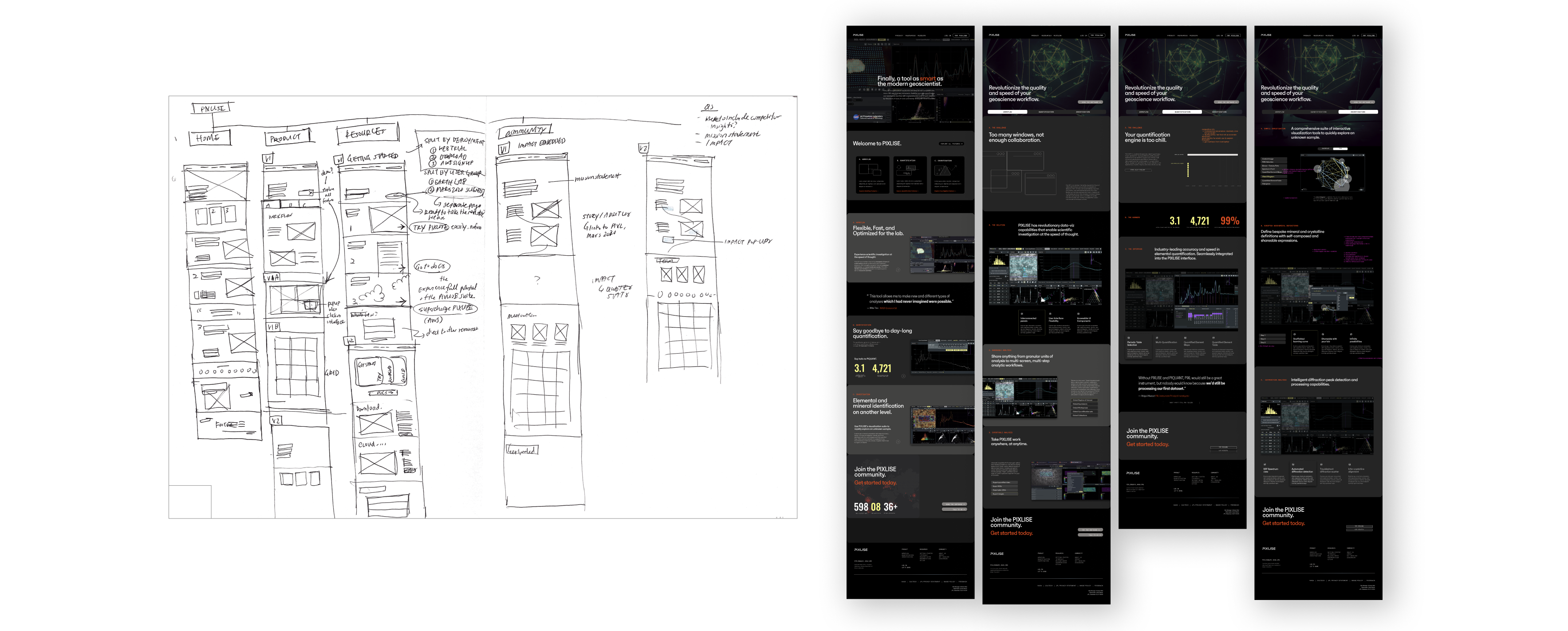
Final Site Map
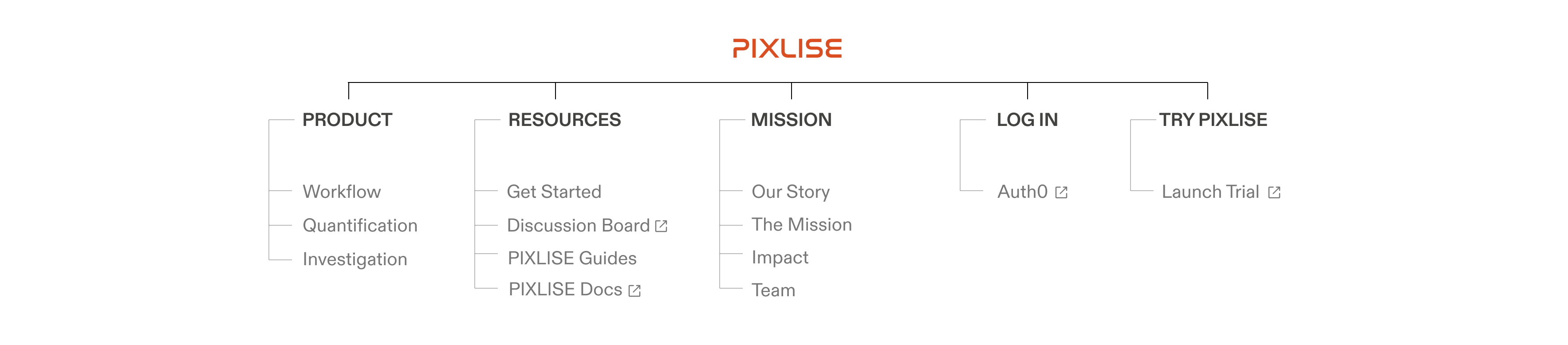
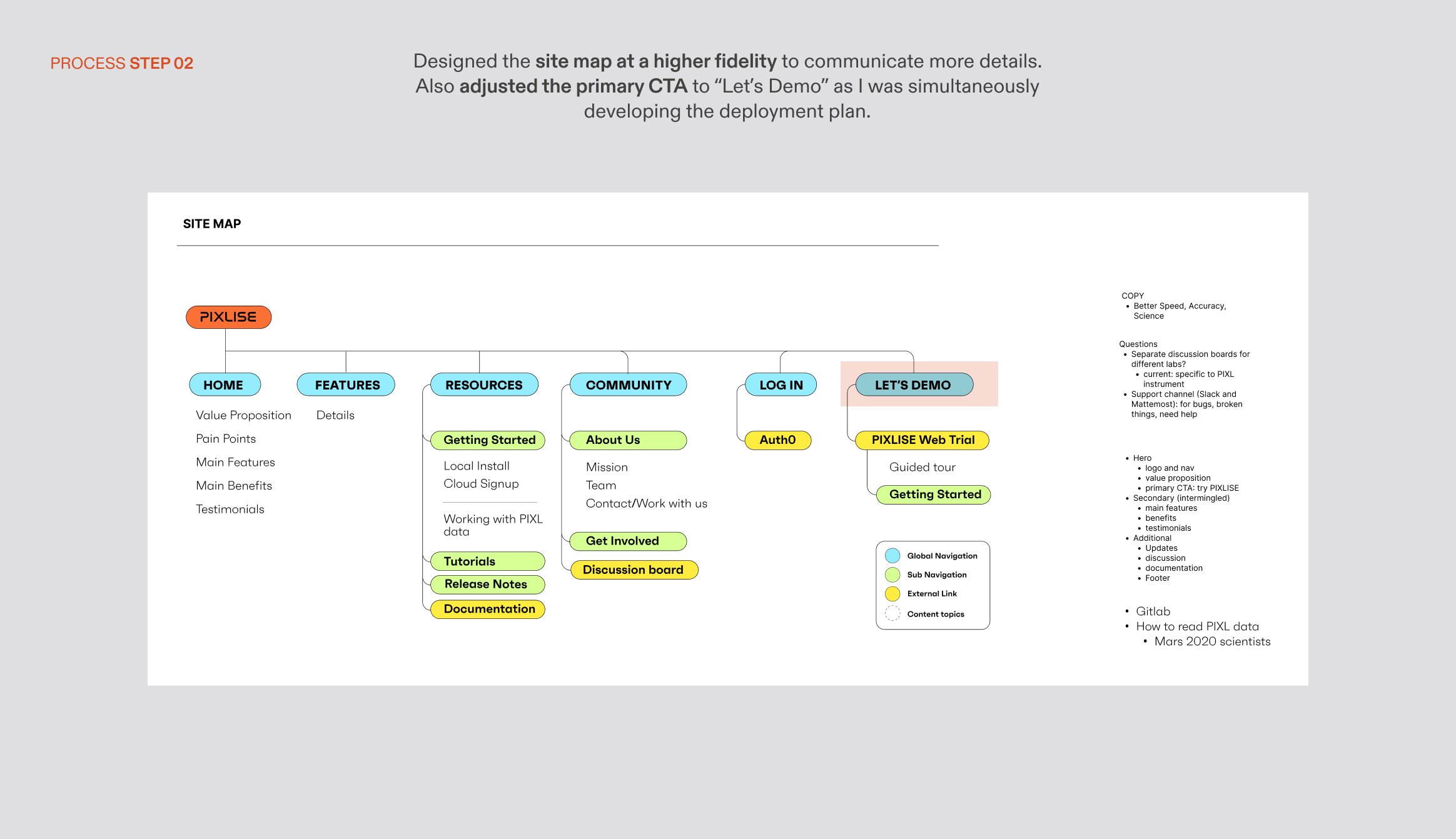


UX Synthesis Process — Site Map
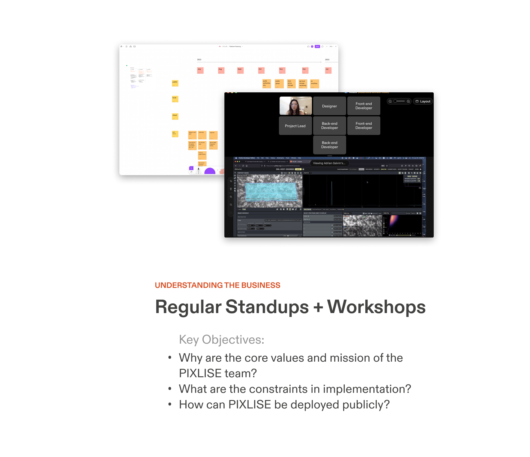
DESIGN SYSTEM + IDENTITY
The public site should be inspired by the product, but better yet, present a more expressive side of the PIXLISE brand.
Weeks of research helped me dissolve the essence of PIXLISE into four core values. It was important that these were reflected in the visual design.
Refreshed design system reflects new product values
The public site should be inspired by the product, but better yet, present a more expressive side of the PIXLISE brand.
Weeks of research helped me dissolve the essence of PIXLISE into four core values. It was important that these were reflected in the visual design.

I strived to communicate the sophistication and quality of this revolutionary tool, yet still stay grounded in the grassroots origins of the product.
Working with the product team, we were able to refine this identity into a design system that is accessible, inclusive, and implemented at scale.
Working with the product team, we were able to refine this identity into a design system that is accessible, inclusive, and implemented at scale.
Final Design System

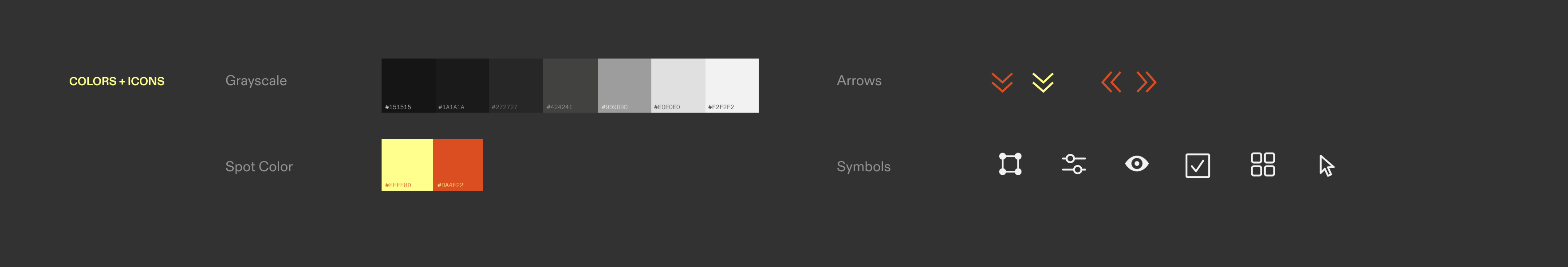
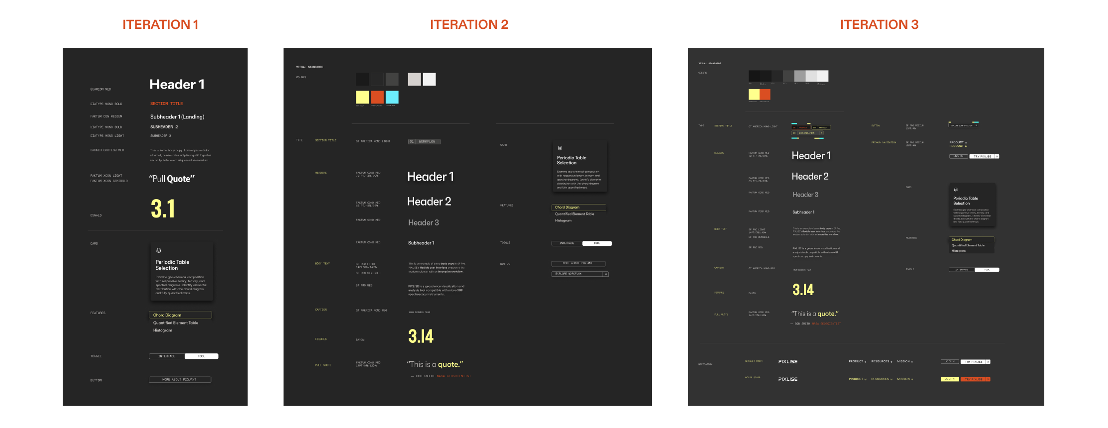
The final visual system retains the dark look of the UI. We highlight with the same PIXLISE yellow spot color, but now with an additional poppy vermillion, inspired by PIXLISE’s Red Planet muse. The energetic type duo ties it all together: the geometric yet approachable sans serif Faktum and the clean monospace variation of GT America.
UI DESIGN
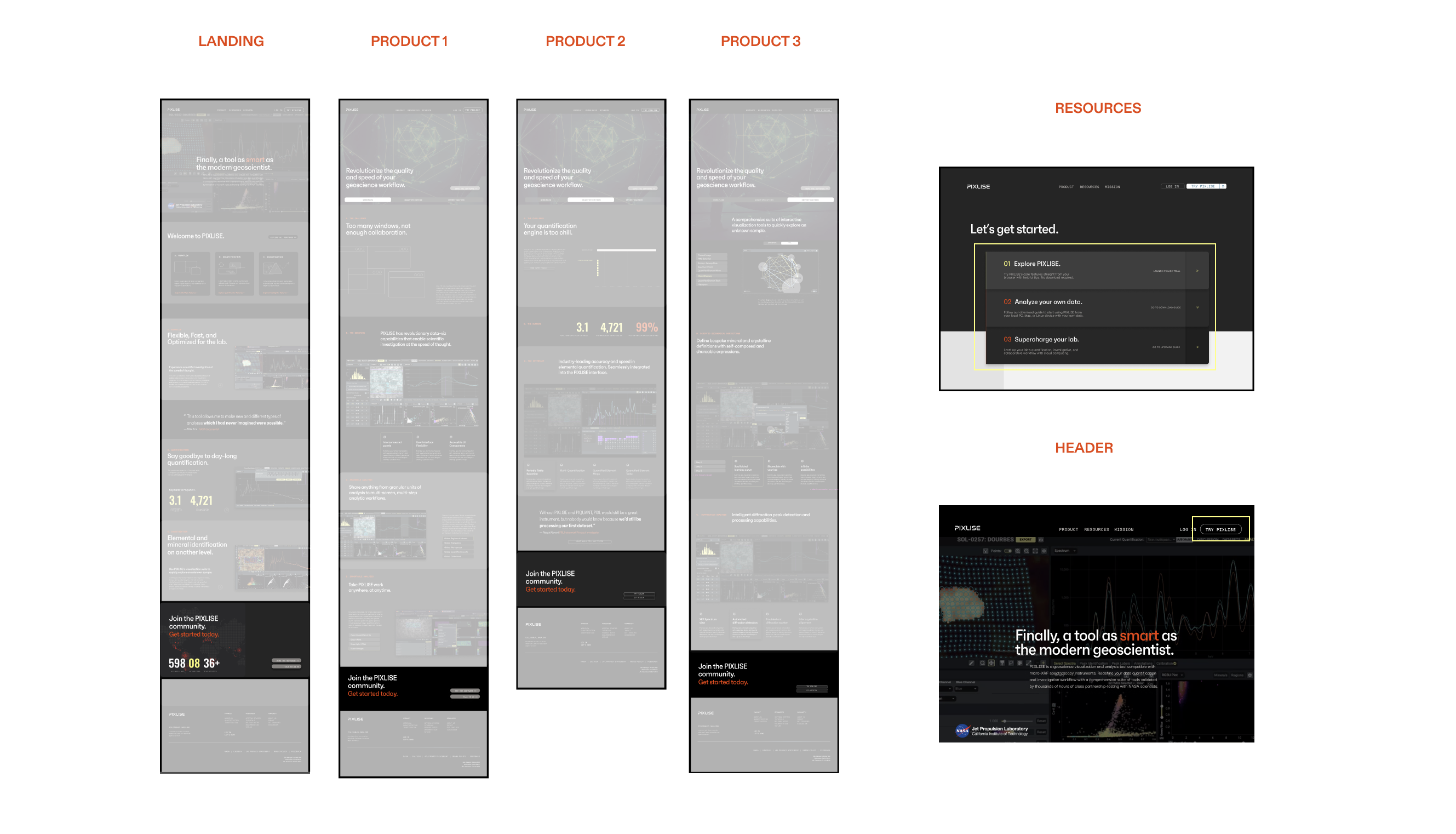
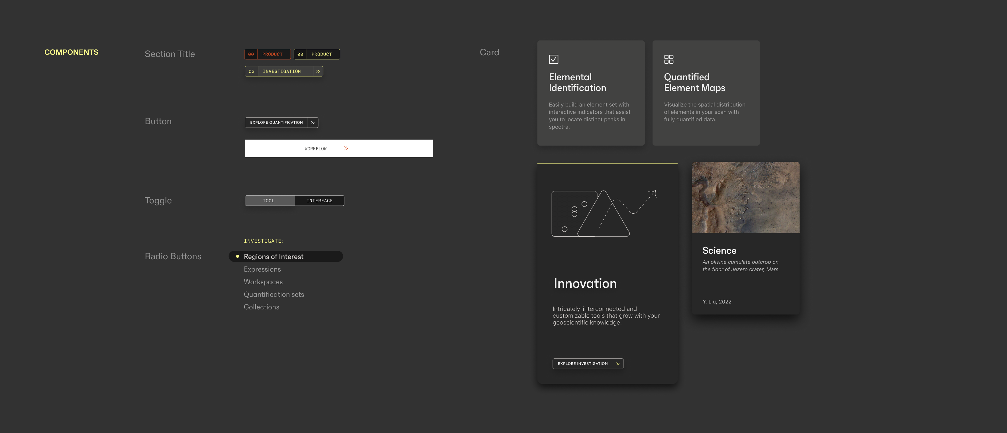
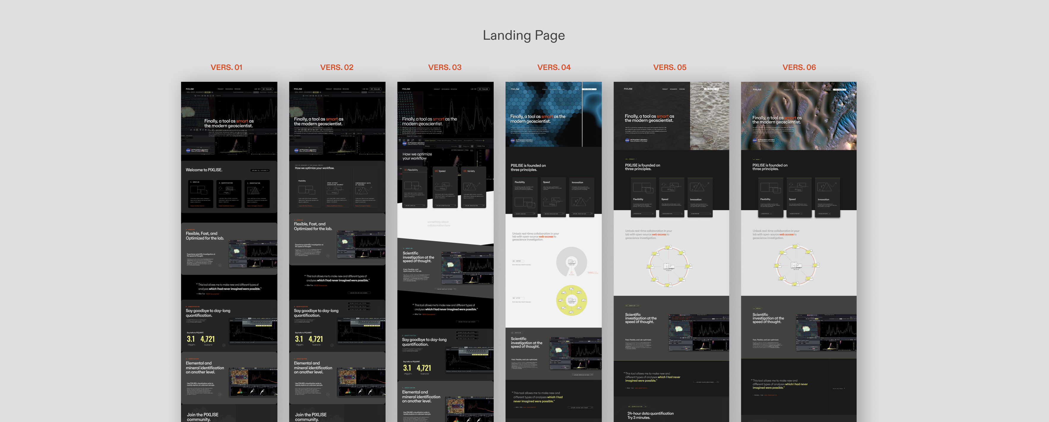
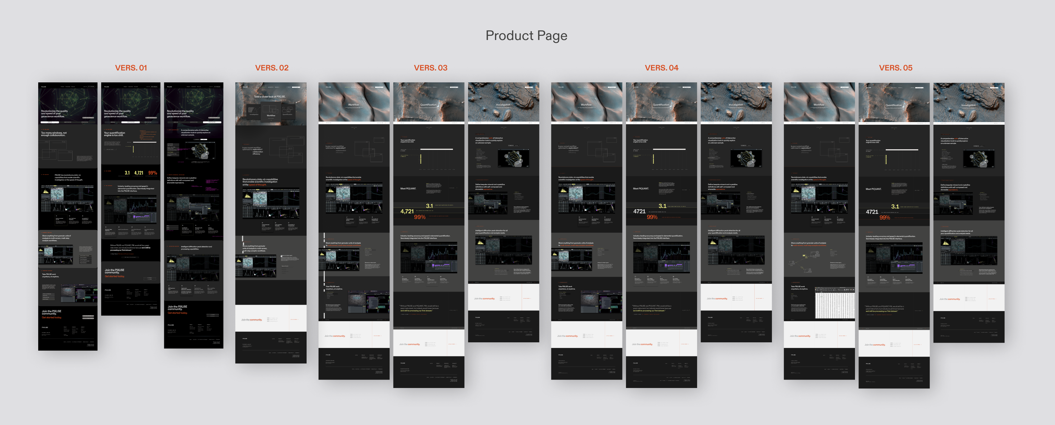
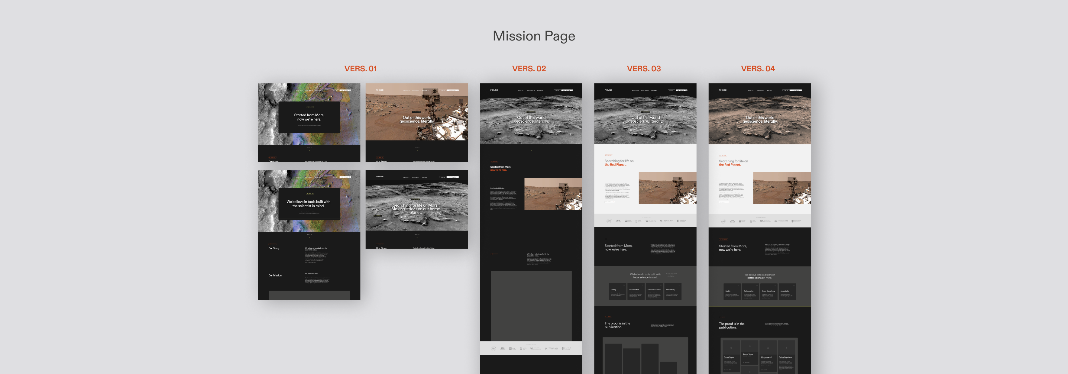
The extensive content hierarchy work established the fundamental structure for the UI, but a lot of design tweaks brought wireframes to fidelity.
At this point, I started considering layout and imagery in the communication of information.
Combining type, imagery, and interaction for the final UI.
The extensive content hierarchy work established the fundamental structure for the UI, but a lot of design tweaks brought wireframes to fidelity.
At this point, I started considering layout and imagery in the communication of information.
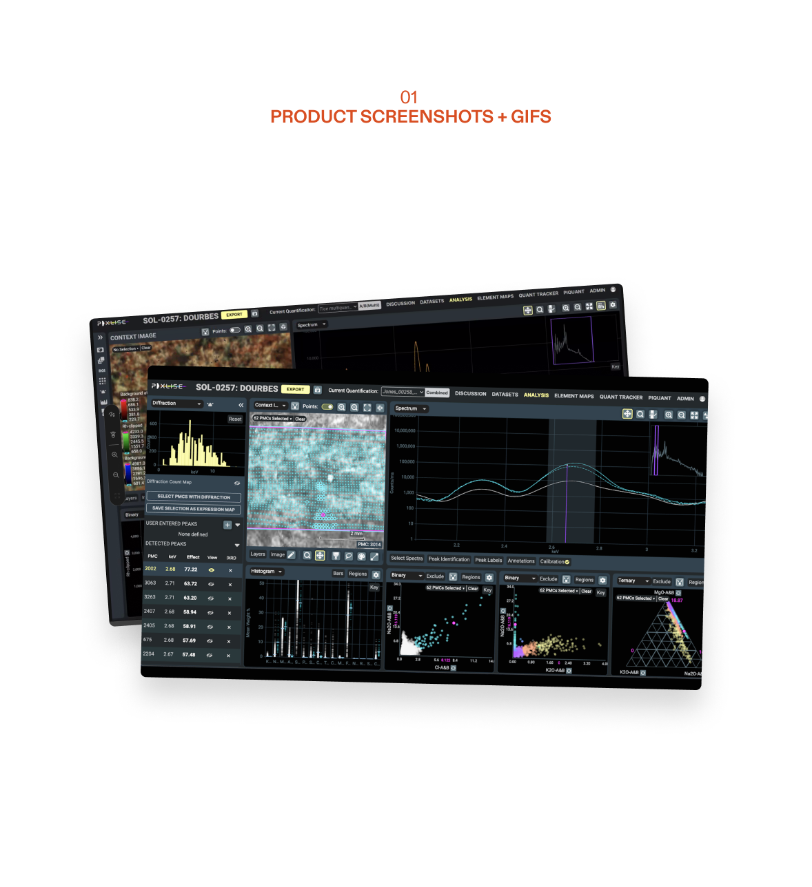
At first, I relied solely on product screenshots to supplement the copywriting. In later iterations, I incorporated simple illustrations to communicate abstract ideas and hi-res geography photos to bring context and atmosphere to the experience.


Screen Iterations per Page

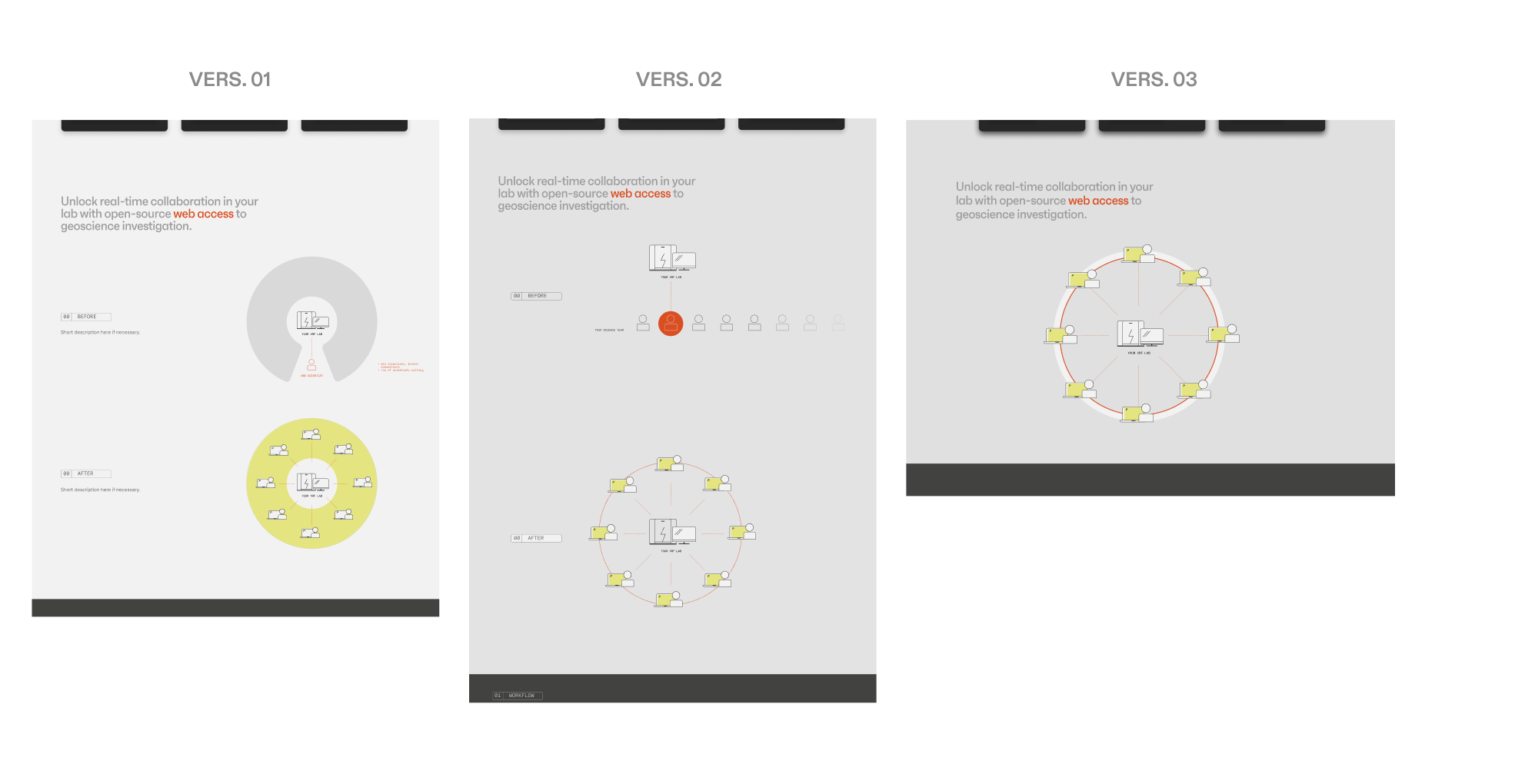
Sketching helped me workshop a difficult illustration (communicating real-time collaboration).
LANDING PAGE COPY:
Refresh the landing page to better understand what PIXLISE stands for.
PRODUCT FEATURES CARDS:
Survey product features quickly by clicking on the informational cards.
PRODUCT FUNCTIONS :
Easily navigate between the three core product functions: Workflow, Quantification, and Investigation.
TOOL-INTERFACE TOGGLE:
Immediately grasp tool functionality by switching between an isolated panel view and an in-context workspace view.
Interact with the final prototype here.
REFLECTION
The ambiguity of our target user and the high level of content complexity made this project super challenging. However, the hardest lesson I learned was to push through moments of uncertainty and get comfortable defining the UX process as I go. My greatest breakthrough was learning to be wrong, so we can get it right.
More learnings:
Writing is design. Balancing precision, concision, and accuracy with something more “punchy” and “marketable” was hard and required its own iterative process.
Don’t be afraid of ugly. Sometimes the scrappiest and ugliest tables/artifacts I made, prototyped quickly in-meeting or after a sudden revelation were the most effective in making progress. The goal is to move the needle forward.
Accessibility is so important. Working with non-designers helped me contextualize the importance of design in a non-creative setting. I saw the impact I could make in 10 weeks, and that alone made the challenges in communication worthwhile.
Learnings and next steps
The ambiguity of our target user and the high level of content complexity made this project super challenging. However, the hardest lesson I learned was to push through moments of uncertainty and get comfortable defining the UX process as I go. My greatest breakthrough was learning to be wrong, so we can get it right.
More learnings:
Writing is design. Balancing precision, concision, and accuracy with something more “punchy” and “marketable” was hard and required its own iterative process.
Don’t be afraid of ugly. Sometimes the scrappiest and ugliest tables/artifacts I made, prototyped quickly in-meeting or after a sudden revelation were the most effective in making progress. The goal is to move the needle forward.
Accessibility is so important. Working with non-designers helped me contextualize the importance of design in a non-creative setting. I saw the impact I could make in 10 weeks, and that alone made the challenges in communication worthwhile.
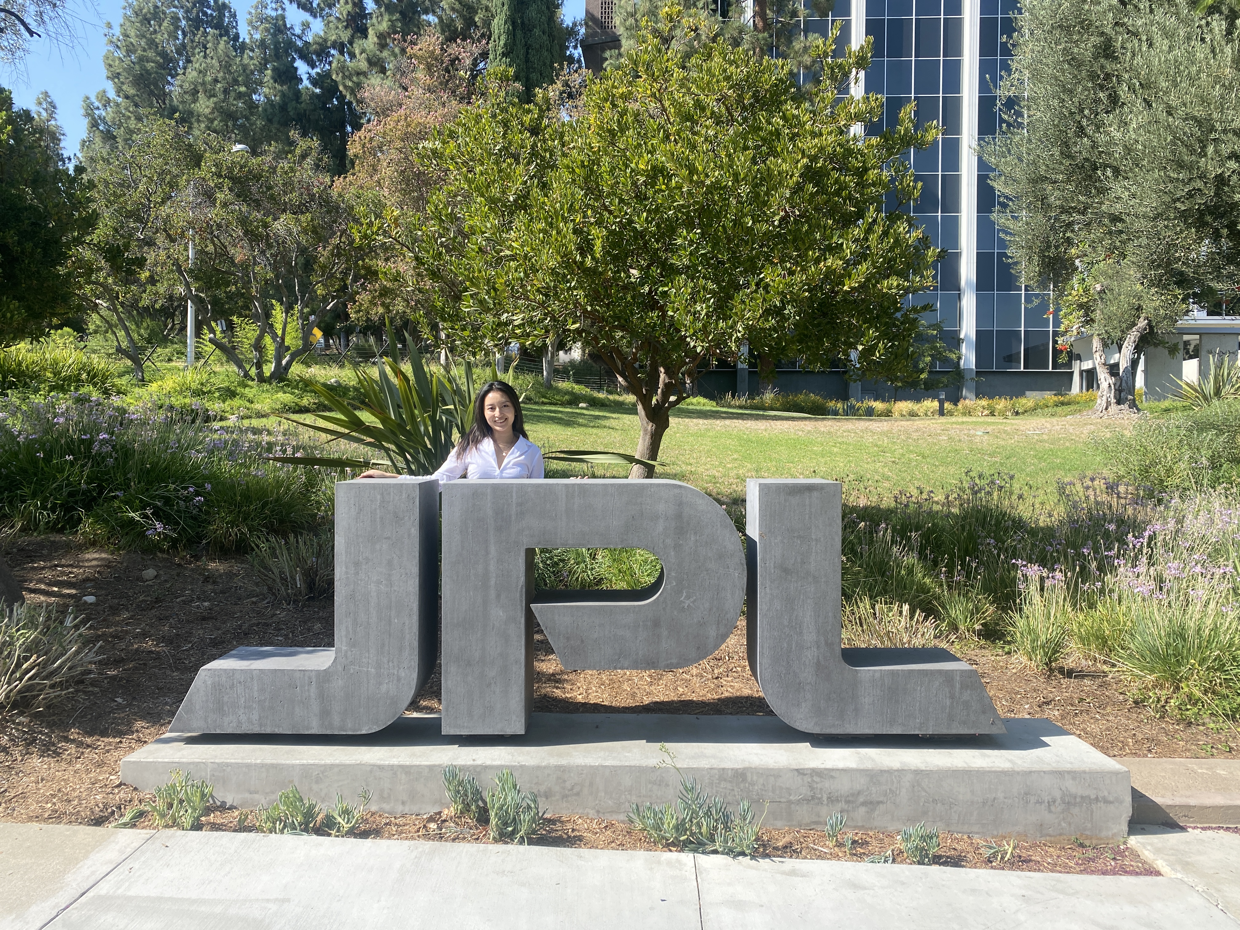 Visiting the lab for the final week and my final presentation!
If given more time and money, I’d:
Access more Earth Labs. It was challenging extrapolating findings with limited access to our target user. In an ideal world, I would interview more earth scientists to validate site success.
Build out Guides. Due to the complexity of PIXLISE’s interface, user support is necessary to troubleshoot and adapt to software changes. I’d love to continue working with developers to build user-friendly guides for increased autonomy and reducing the core team’s workload.
Assist Deployment Success. I got to help workshop preliminary strategies to deploy PIXLISE at scale. It would be super cool to continue doing this to bridge UX and software capabilities!
Presenting this project to the Mars 2020 PIXL science team was the most gratifying moment of my career to date. I got to see scientists react to my process and get a glimpse of the positive impact design can have on scientific inquiry. This project reinforced my belief in the importance of user-centered design.
The website is not finished. I look forward to continue systemizing design components to optimize implementation for the developer team. I’m also applying my knowledge from this summer to design the PIXLISE trial experience!
Stay tuned 🚀~
The website is not finished. I look forward to continue systemizing design components to optimize implementation for the developer team. I’m also applying my knowledge from this summer to design the PIXLISE trial experience!
Stay tuned 🚀~
